BOOK COVER SERIES DESIGN: PART 2. PROFESSIONAL DESIGN OF BOOK COVERS FOR A SERIES (OR COLLECTION)

Welcome to PART 2 of my series of articles on book cover series (and collections) design. In this article I will show a method of creating a unique book cover template system for a book series (which could also be applied to a collection, even one that features different authors).
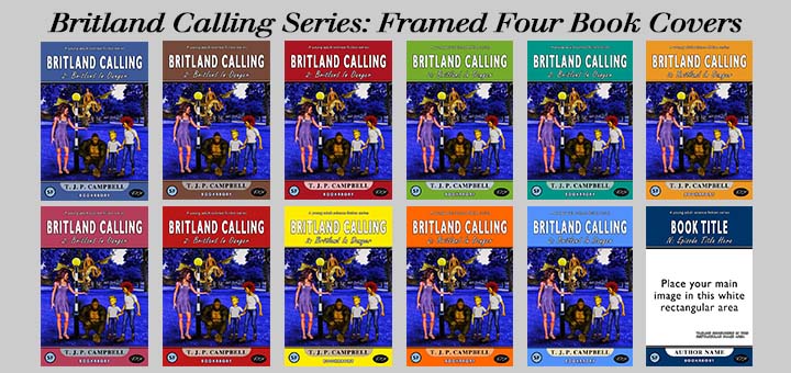
I showed in an earlier article a quadrilogy called Britland Calling. Here are the four book covers again:
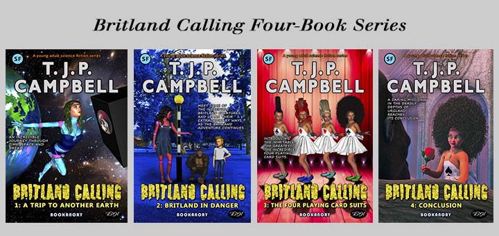
This series is recognisable by the standout font of the series title Britland Calling and the simpler font of the book episode. Also the Author Name is in the same position and of the same font. And the 3-D art work I did was all in the same style using character representations from the series. Note that because this series is written for the younger reader (though Adults can enjoy it too) the covers are colourful and purposely 3-D art. The fact is the series features a lot of characters who are non-human intelligent living toys. But it is also true that these Britland Calling book-covers follow my commonest template that I use for most of my books. So as an experiment, I will develop a unique book cover template for this quadrilogy. The reason I think this might be a good idea, is because I think I could do a better job of presenting the title font. The current one is limited to the younger reader (I think). Bearing in mind the Harry Potter series shown earlier in this article, I will design and create a new Britland Calling series.
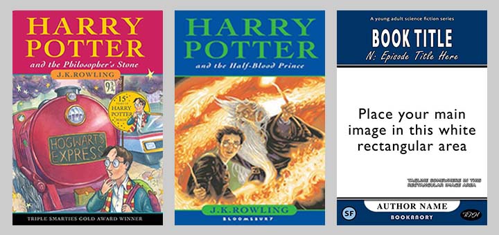
As a starting point I will remind the reader of the famous original first printing of the 7 book covers of the Harry Potter series:
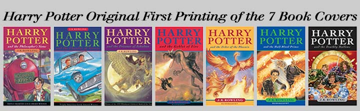
These books use what is known as a frame design. The main image of the each book is placed in the same area of the cover with the same outer template. Only the colours of the template change. In the above case, the colours of the texts change too. Notice that in the first three books, the author’s name appears at the top just under the Author Name and Book Title. In the other books, it appears at the bottom. Later editions put all the Author Names at the bottom for consistency. So for Britland Calling, I will use a frame designed template. And let’s see what I end up with.
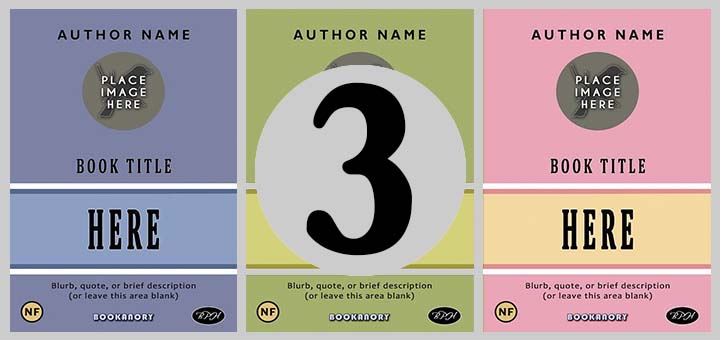
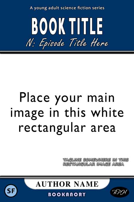
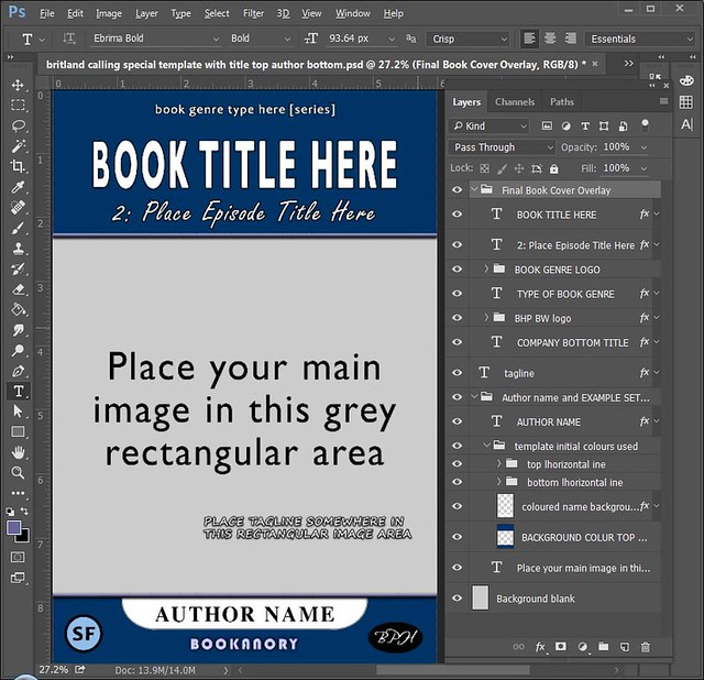
I don’t want to copy the template, but I do want it to be generically similar. I created the following template in photoshop:
Below is an illustration to show all the components of the template laid out in the photoshop layers shown to the right:
Below is an illustration for you to compare the Harry Potter series of framed design and mine:
The main differences between my series book covers will be that as I decided less is more (as is usually the case in graphic design), I will use only white lettering in my series Book Title and series Episode Titles. Also, I will also use only black lettering for my Author Name on all book covers. Only the colours of my dividers, my Author Name background pattern, and my top and bottom rectangular background areas will change. You will notice in the Harry Potter series above, that the colours of the texts do change. I personally believe this weakens the book cover as too many colours causes too many clashes. The great thing about the first cover is the image of a boy with a lightning bolt scar on his face and an old-fashioned steam train at platform 9 3/4. That is the image we wish to promote. I think too many colours slightly distracts the observer. And then, you would be committed to changing colours on all the subsequent covers, causing more likely distractions. Anyway, at least the Harry Potter book covers are very colourful, which some people like. It is subjective to a certain degree. Notice also, unlike the Harry Potter covers, I decided on a non-serif font for the Book Title and an italic handwriting font for the Episode Title. My Author Name, like the Harry Potter series, is a serif font. I feel the balance of serif and non-serif is an important one in a frame design.
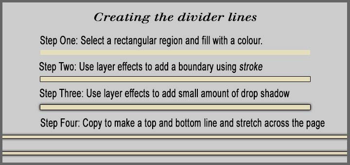
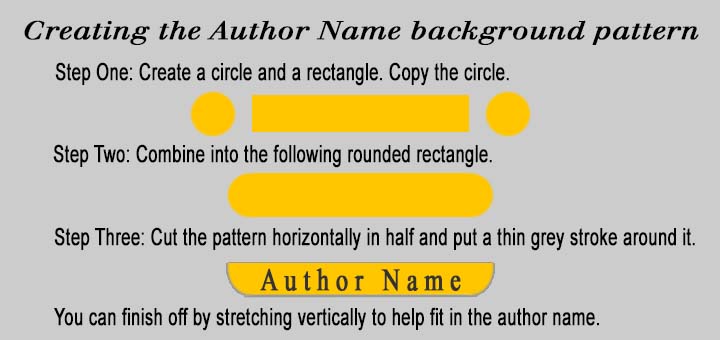
First, before discussing the colours system I chose and showing you my finished book covers, let me show you how I created my divider lines and my Author Name background pattern in photoshop (you could do the same in Gimp).
Creating the dividing bevelled partitions:
Creating the Author Name background pattern:
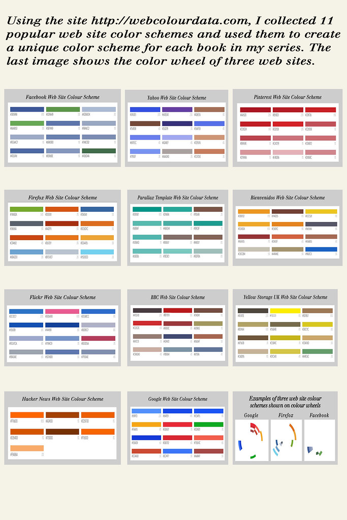
And how will I select my colours? I considered colour schemes from popular web sites using webcolourdata.com. I collected 11 popular sites: Facebook, Yahoo, Pinterest, Firefox, Parallax, Bienvendios, Flickr, BBC, Yellow Storage, Hacker News, Google. I also considered the colour wheel to aid my selection of the colours used on the top and bottom, on the Author Name background area; and, finally, the top and bottom dividers. Below are these 11 schemes along with three colour wheels from Google, Firefox and Facebook:
Be careful with your colour maps on photoshop. You might find they don’t look exactly the same as the RGB hexadecimal code shows on webcolourdata.com. You need an RGB scheme that reflects the colours you see online. By typing shift-Ctrl-K on photoshop an unopened color settings window opens, as shown below:
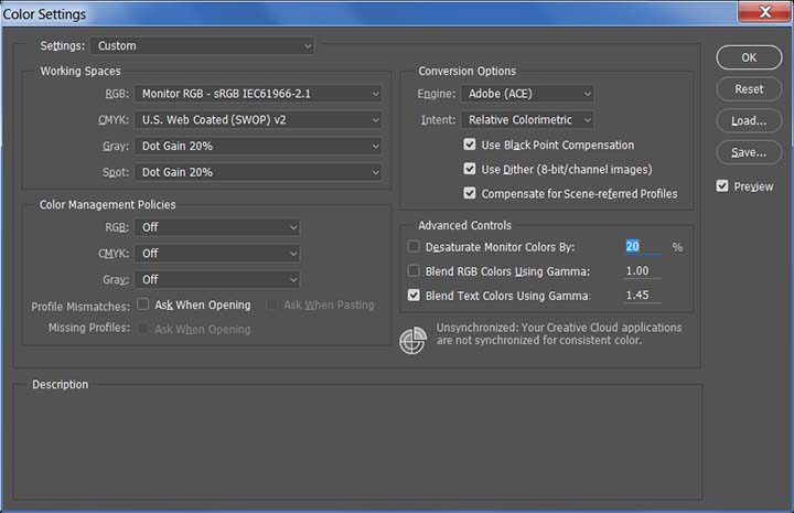
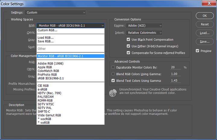
Clicking on RGB drop-down tab yields the colour schemes available. I chose the Monitor RGB as my working space because I am working with images that are mainly online (as opposed to being images sent to a printer). Be careful if you change your colours as they will affect any images you previously created with a different colour scheme (I would advise you spend some time researching photoshop colour management online). Below, I show photoshop CC’s available colours:
So the first thing I did was select a book cover main image and see how each of them looked with my selected popular website colours. Below shows all possible colour selections with Book Two of my series:
I decided on using the Parallax website for Book Two (shown fifth on the right on the top row above):

And here is my choice for the four book covers:
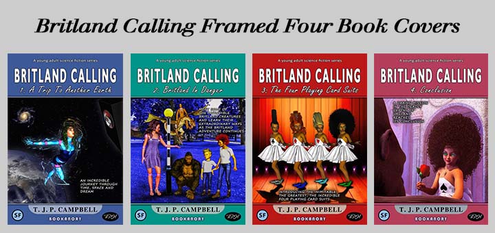
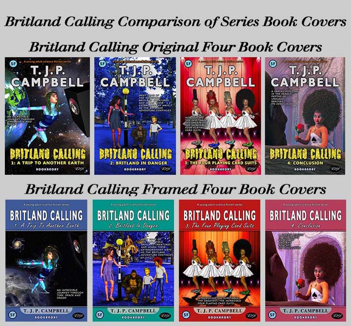
Finally, below is an illustration to show a comparison of the original Britland Calling four book covers and my new framed series design (I did a bit of extra work on the main images):
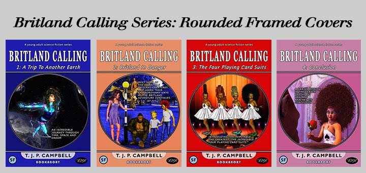
One last point is that another scheme of colouring I thought of was to use a predominant colour of the main image for my frame background colours. This might be worth considering. I tried this, but I also tried a rounded inside frame system and ended up with:
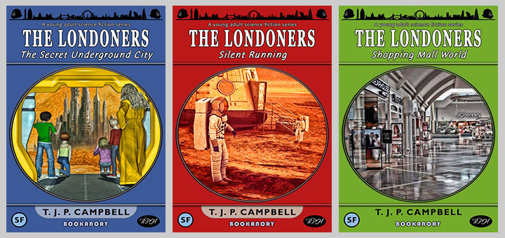
Then I decided to upgrade my The Londoners series using this series design template and using the above image dominant colour idea. I ended up with this:
I will leave the colouring scheme system up to your imagination. As you saw, I just tried the dominant colours of popular websites and the dominant colours of the main book cover image. I wonder what if any system inspired the designers of the Harry Potter series shown in this article?
Well, that’s it for this PART 2 article. I’ve never seen an article like this before, so hopefully this article will have been very useful to book cover designers and give an insight into how designers like myself sometimes operate.