BOOK COVER SERIES DESIGN: PART 1. BASIC LOOK AT A SERIES OR COLLECTION OF BOOK COVERS
Welcome to my two articles on book cover series (and collections) design. The idea here is that we are considering a predetermined series. In the Harry Potter series by J. K. Rowling all the books followed a predetermined book cover series style for example. She had always planned for the books to follow the progressing years of Harry’s time at Hogwarts. Whereas with Lee Child a new Jack Reacher book could be published at any time. Also Lee Child book covers sometimes vary according to current trends. I think you’ll see the subtle difference after working your way through the next two articles.
In the previous chapters on the emulation of styles we touched on book cover series design, now we will examine it more deeply. It is important to allow the reader to instantly recognise the book of a series or collection through its design, the way it looks. Consider a series: if you release the first book having not written any others in the series, then the reader will not recognise the series, of course. But you could still make it clear it is part of a series or a specific collection. So how do you make your covers instantly recognisable as part of a series (or at least recognised as being by a specific author. Well, making the branding layout of the publisher that handles the imprint, is a must. I will always put my genre logo, company name, and company logo in the same position on the cover. Then if we similarly position consistently our Book Title, Author name and any taglines, loglines or blurbs, and use consistent fonts; this will help too. Finally we should use consistent methods of our art presentation. For instance, in a Lee Child Thriller book cover, as we have seen, there is often a mysterious man, back turned, facing a journey in a sprawling landscape along a road or path of some kind. Also his covers tend to have an image located at the very top (an airplane, helicopter, sun, moon, bird etc).
Perhaps it would be a good idea if I now start with a famous example of a series, and possibly the most famous series of book covers of recent decades is the 7 Harry Potter book covers that sold the first batched of the Harry Potter series. To refresh your memory, here they are:
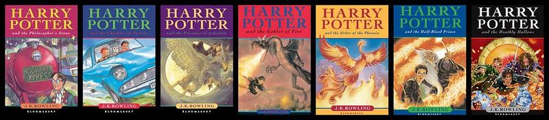
Notice how the Bloomsbury branding is consistently placed in a non-obtrusive fashion right at the bottom, just under the Author name. As J. K. Rowling was not famous when this series design template was created, her name is very small in comparison to the title (which has a large “HARRY POTTER” beginning each book title). Now that she is famous, later book covers in reprints will have her name much bigger. Dan Brown always has his name in giant letters as does Lee Child and a lot of other famous authors. The style in the main picture is consistent enough (even though the artists did vary). Possibly, the last book was over-done compared to the first six.
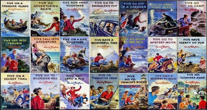
Note, that another million seller book series was Enid Blyton’s 21 Famous Five series. This was marketed the same way as Harry Potter in that the “Five” name always appeared prominently on the book as part of the title. Here are the 21 Famous Five book covers whose books probably made more money for their author than any other series did in the history of literature:
Today, it is a very useful strategy to at least produce a trilogy of books, so that you can market your books (especially if you are self-publishing). This is so you can do things like give the first book away free or at a much lower price than the succeeding books. I have a few trilogies ready for publication but I also have a quadrilogy (four books), as this gives even more marketing strategy opportunities. Anyway, back to trilogies. The most famous trilogy of books I can think of is J. R. R. Tolkien’s Lord of the Rings:
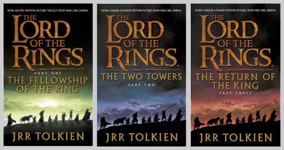
The particular series of book covers I have chosen (out of the many that have been done on this famous trilogy) is pretty consistent, but maybe too consistent. Notice that the images on book 2 and 3 are identical. Only the colour of the sky has changed. That’s just being lazy. At least have them all the same or all different. Still this is one example of many reprints I have seen.
A recent trilogy that was extremely successful was the Hunger Games:
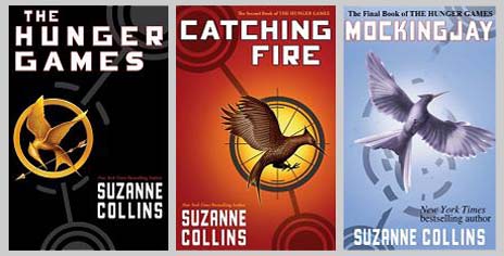
Again, consistent fonts but enough divergence of art to make things interesting.
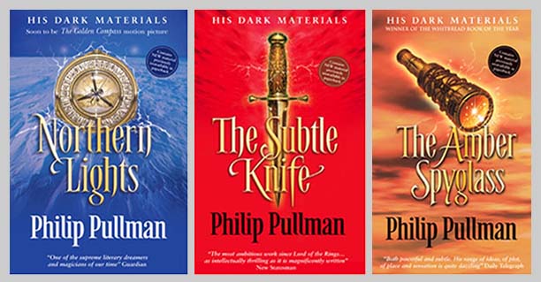
Then there’s one of my favourite trilogies, Philip Pullman’s His Dark materials (in the USA the first book is titled The Golden Compass):
Now let me show you some of my trilogies.
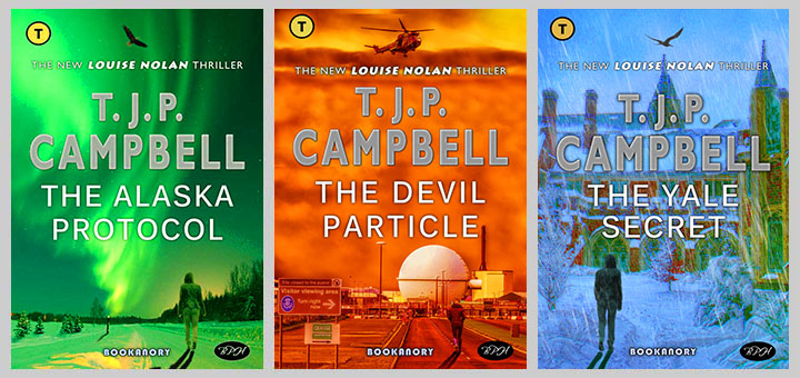
I have already shown the Louise Nolan trio of books in which I used a generic Thriller style which more or less followed the standards of the Jack Reacher Lee Child books. Here is that trio:
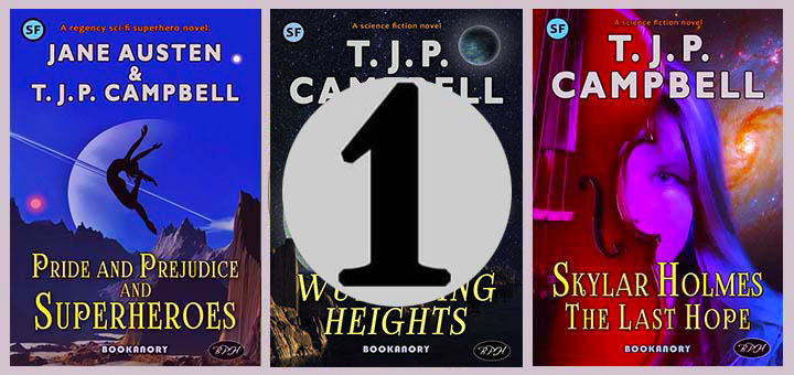
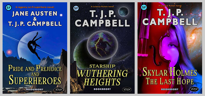
I also did a mashup Trilogy where I used famous Classics and mashed them up with modern science fiction. For instance, I wrote Pride and Prejudice and Superheroes ( for which I have already had a couple of approaches from bona fide publishers), and have two books on the go to make up a trilogy. Here are the book covers for the trilogy:
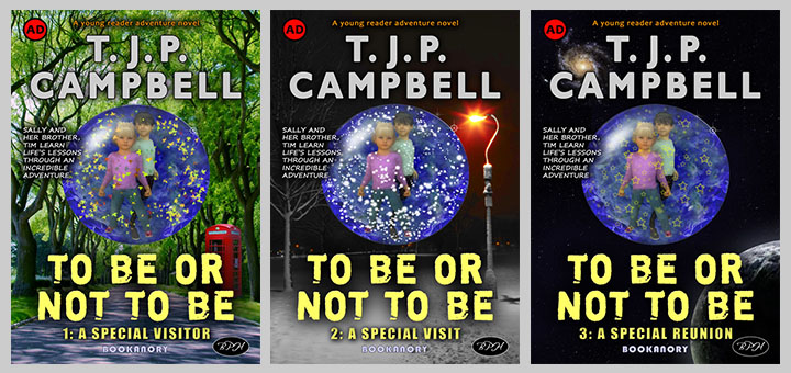
Another trilogy I have written the first two books to and drafted the third is called To be Or Not To Be. I would not attempt to sell these two completed books until I have the third finished. I think you’ll sell a lot more books if the reader knows the series is complete. There’s nothing more frustrating than a series of books (or TV series programs) that suddenly end without a satisfying conclusion. Here are the trio of book covers to this series (notice how I used a crystal ball make the covers all related to one another):
And of course, you can present a nice image of your trilogy on the three visible faces of a cube like this:

Other series can contain more than three books, as shown by earlier examples in this article. Here are two other famous examples in which I will show a trio of examples. The book covers speak for themselves:
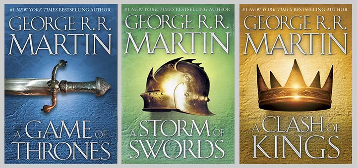
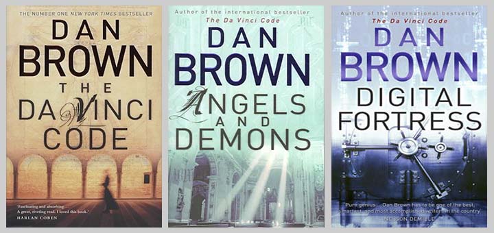
Again, in both these two excerpts of well-known series, we have consistent fonts and styles. In the Dan Brown books, as in the Hunger Games books shown earlier, we have enough divergence of art to make things interesting for a designer and reader. If you look closely at the Dan Brown book covers, there is a lot of subtle detail.
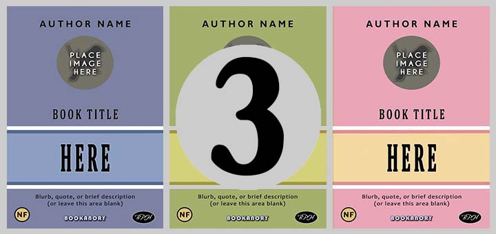
As we can see from all these examples, publishing companies use specific templates for their books to make them recognisable as well as incorporating branding by presenting familiar logos and trademarks. The branding must be placed in such a way on the book cover that it does not intrude on the main selling image of the cover. But by being there, it gives the potential buyer confidence in the standard of the novel that can be expected in terms of story, readability, layout, grammar and punctuation. I think Bloomsbury does this well on the Harry Potter book series shown earlier in this article. Bookanory Publishing House places its logo company name at the bottom of the page and a BPH pictorial elliptical logo in the bottom right-hand corner. The BHP logo is usually balanced by the genre icon which is placed in the top left-hand corner. All Bookanory book cover templates are then designed bearing the genre icon and company logo positions. Of course, publishers go further by designing their specific book cover template designs for certain authors and perhaps certain series of books (as Bloomsbury did with the Harry Potter series). around their main branding decisions. The aim is to provide something that looks inventive and fresh, yet familiar. When selling anything to the masses, this will always be the case. So what book cover templates do I design for Bookanory Publishing House? Below is a quintet of Bookanory book cover templates often used for their book covers:
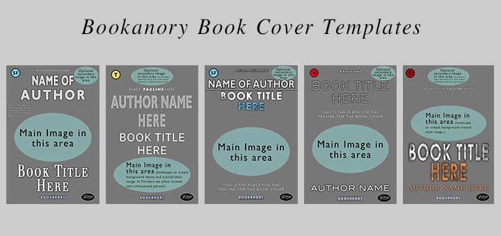
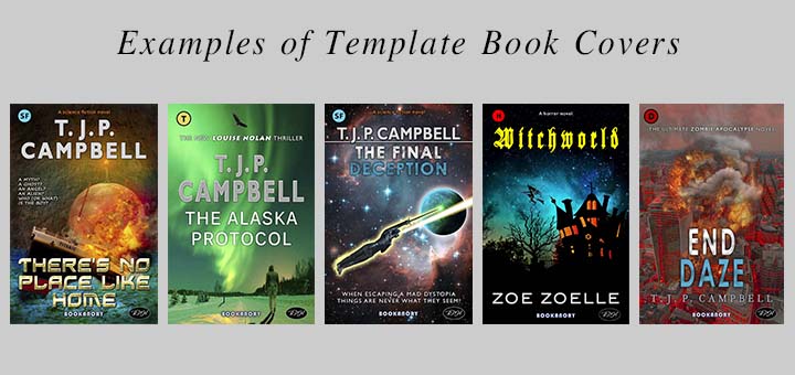
And here are these templates with book cover examples based on them:
That concludes this PART 1 introducing Book Covers used in a series and in collections. In PART 2, I will show how I developed a professional and flexible series of book covers.