| Red | Energy, enthusiasm, emotion, power |
| Dark Red | Passion, depth, dominance, prestige |
| Orange | Positive, dynamic, optimistic, confident |
| Pale Yellow | Friendly, approachable, warm |
| Bold Yellow | Ambition, motivation, creativity, cutting edge |
| Green | Nature, vitality, environment, health |
| Blue | Dependability, trust, thoughtfulness, calm |
| Dark Blue | Deep sincerity, intuition, truth |
| Light Purple | prosperity, spirituality, creativity, harmony |
| Dark Purple | Depth, wealth, mystery, fantasy |
| Grey | Sophistication, knowledge, prestige, wisdom |
| Pink | Youth, playfulness, emotion, innocence |
| White | Clean, straightforward, self-sufficient, simple |
| Black | Authority, power, control, mystery, suspense |
| Brown | Natural, of the earth, comfortable, organic |
BOOK COVER DESIGN: PART 1. BASIC COLOUR USE IN BOOK COVER DESIGN


Welcome to Part 1 of my 5 part book cover design series. In this article I will be examining a graphic design fundamental subject in relation to book cover design; namely, basic colour use in book cover design. Throughout this series, by using my own book covers and examples, I hope to add to the huge reservoir of online and ebook articles on book cover design. So without further ado, let us commence.
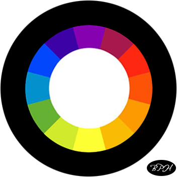
There are many things to consider when designing a book cover. There’s the target audience. The genre. The book the cover is attempting to promote or represent well. Many things. But perhaps a good place to start is with the fundamental use of colours. Below is a diagram representing colours. It is the well-known colour wheel, but I have added white in the centre of the wheel and black on the outside.
The Colour Wheel
The dominant colours on a book cover design decide the mood and often indicate the genre. Black and white are the ultimate powerful contrasting colours one can use. If you can think of a simple object that represents your book, then using black and white and a grey-scale object is bound to produce a good design. If you use a fancy font for the title and an ordinary (but professional looking) font for the author name, you will inevitably produce a powerful professional book cover. Here is an example. Suppose I wish to create a book cover for a classic hard-boiled detective novel, which I’ll call “Black Blood”. I will now go on google and look for an image of a magnifying glass. Convert it to grey-scale using photoshop. Then create a book cover. Let’s see what happens…
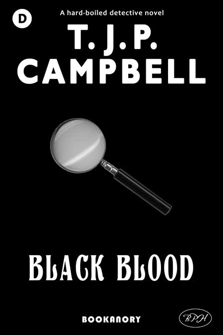
The google search for the magnifying glass took five minutes, but then cropping the object and finishing off took about an hour (as I was multi-tasking on other jobs). Notice I also used the Bookanory Publishing House branding system (a genre statement at the top, a company name and logo at the bottom, and a genre identifier at the top left). Still the point has been made. Below, I have made an enhanced cover using some added black blood dripping on the title together with subtle colours added. I added red for the genre identifier (usual for the detective genre), a subtle light grey for the author name (my usual colour), and a light blue for the company name logo.
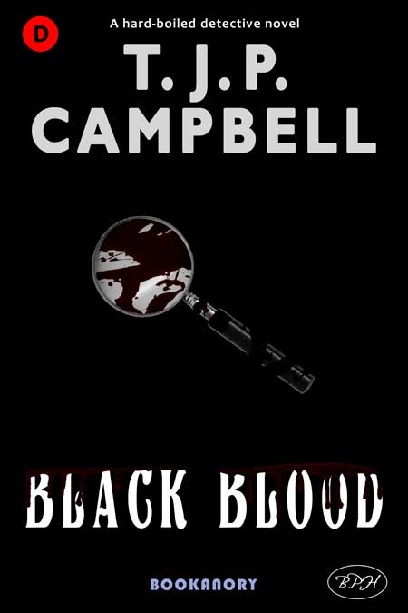
So that gives us a feeling for black and white with subtle enhancements. As a final point, notice that the book title helps the dominant black colours appropriate (Black Blood).
Okay, now, referring back to our colour wheel, it is fair to say most book covers will use up to three dominant colours. Which colours should we choose? Well, colours are seen fundamentally as either complementary or analogous. Complementary colours are on the other side of the colour wheel from each other (more or less), while analogous colours are those near each other:
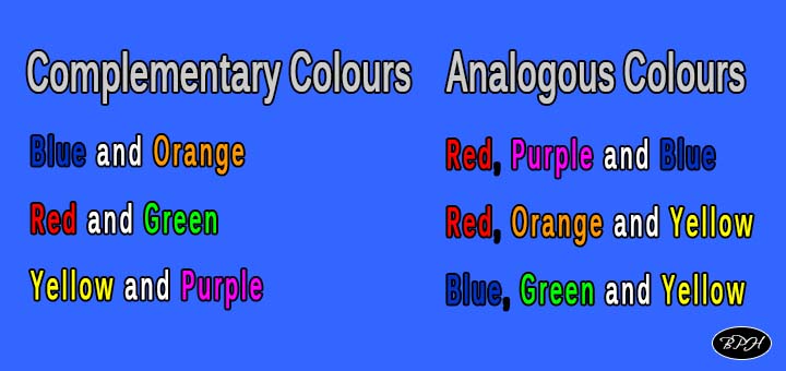
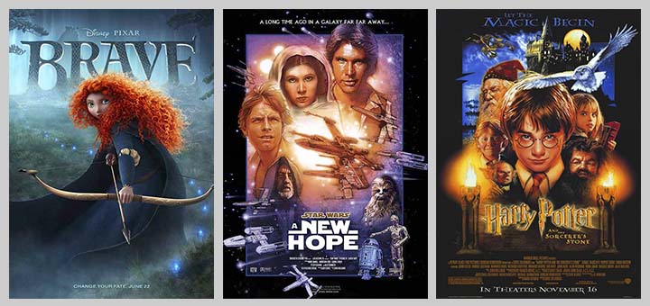
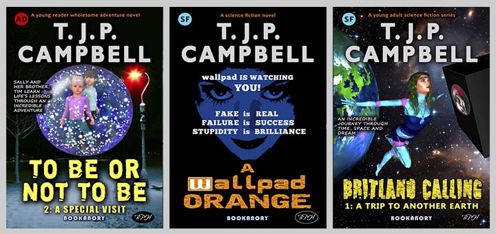
Complementary colours tend to create power and punch, whereas analogous colours provide a more harmonious and passive quality. To really complete the colour picture we need to add the dimension of shade and brightness. Then it would all come down to artistic ability. The most powerful complementary colours in use in the movie industry tend to be orange and teal (that’s orange and blue). Think of Batman and a fiery explosion. These combinations can be used on book covers for many genres. Below I give three examples of Orange and Teal from the movies, and then three of my past book covers that use such a scheme:
I think book covers should never be too busy, so as I advised before, I think it a good idea to stick to at most three dominant colours. Remember, we are talking dominant colours, so if you include photographs they will probably have more than three colours. So choose photographs with no more than three dominant colours. You can always manipulate the photos to do this if they don’t in their raw states. One method often used by book cover designers is to colour wash photos so they show shades of only one or two colours. Below is a cover I did that washes a colour photograph to create a classic Orange and Teal book cover (the teal colour is found in the eyes of Terry the Tiger and the text of the book title):

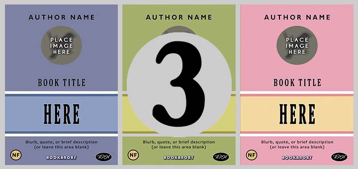
I now give three book cover examples, created for this article, that emphasize colour principles using complementary and analogous colours:
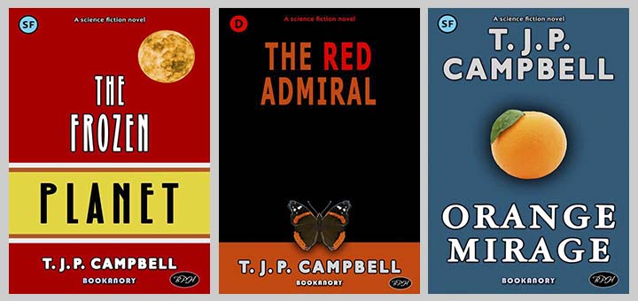
The image of the book cover on the left shows a tranquil system of analogous colours (red, orange and yellow). Although I have used it for a sci-fi genre cover for the novel The Frozen Planet (because that’s what I usually design book covers for), I’d say, it’s probably best on romance and non-fiction books. The middle book cover image shows a neutral cover (not using analogous or complementary colours). This cover works by using the neutral colour black and then using the colours from the butterfly. A touch of subtly is added by including the analogous colour red for the word “red”. The book cover image on the left is an example of Orange and Teal (complementary colours) that should stick in the head because I have used an image of an orange. What I would say, is that an understanding of basic principles does help a designer create powerful an elegant book covers with incredible simplicity. I really like the two book covers shown in the middle and on the right and yet they took me less than an hour using only public domain images. And yes, the butterfly book cover is a common theme (because butterflies are very symmetrical and pretty and also seem sophisticated). But common themes should never be ignored. Consider, for instance, Hollywood Orange and Teal movie posters. They all seem so archetypal. But always remember, the purpose of a book cover is simply to get the reader interested to go one step further. Being over creative is not recommended and almost always counterproductive.
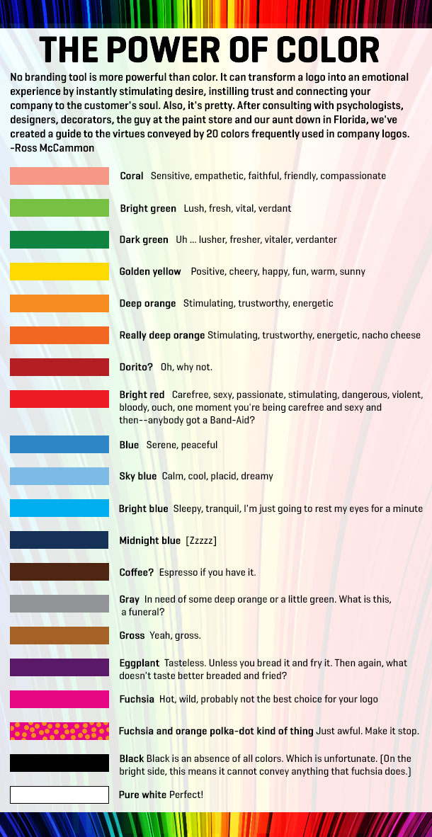
Here is a list of what colours often represent (as found on www.cover designstudio.com):
Another well-used chart of colours and their representations comes from https: //rachaelritchey. com:
That wraps up this article on basic colour use. I hope you enjoyed it and it helps you either create your own book covers or choose a suitable designer to do one for you. I offer a book cover design service, so you can always check out my services. Part 2 follows next when I’ll examine the basic components of a book cover.