BOOK COVER DESIGN: PART 2. BASIC COMPONENTS OF A BOOK COVER

Welcome to Part 2 of my book cover design series of articles. In this article I will be concerned with the basic components of a book cover. Most of the article will concentrate on the front cover (which is all you have with an ebook, for instance). However, below I start with a presentation of a full book cover from one of my popular novels:

Here we see the three major constructs of a full book cover: the front, the back and the spine. Click on the image for a full-sized image in a new window-tab. The front cover’s main components are the Author Name, the book’s Title. Secondary components often included icons for the book’s genre, taglines (slogans or a catchy line like, “She loves the man who hates her.”), loglines (what the book is about in a sentence), publishing company name and logos. The spine has some these same components. The back cover has additional information on the author, a teasing description of the novel (main blurb), an ISBN number or graphic, a quote or two regarding the quality of the book (like, “Best Seller for over 2 months on New York best sellers list”), and possibly the publishing company’s name and logo. As there is often some confusion over the difference between a logline and a tagline, I refer you to the following article: 10-tips-for-writing-loglines. Also note, that you can think of the blurb as a pitch for your story. It is certainly not a summary (unless you can summarize without giving away a single spoiler!).
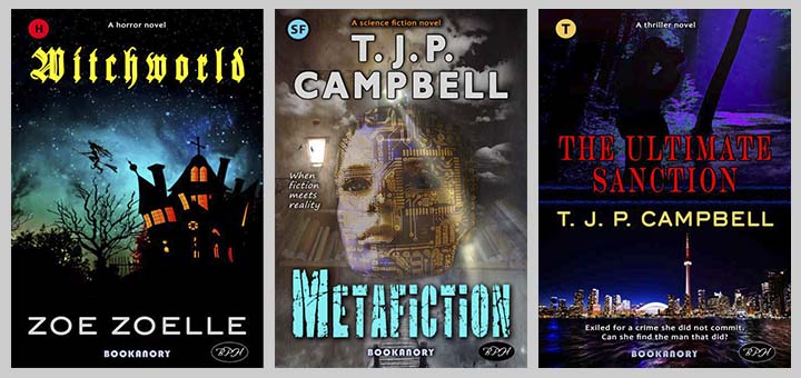
Now let us concentrate on the front cover only. The first point I would like to make is that designing a book cover is not necessarily an isolated affair. Sure, if you are only going to sell one book, then you can do a perfect design with no competing components. But if you are going to do a series you will probably want a very similar book cover template. For instance, your Titles will all have the same fonts and positions. Below is an example of a four book series I wrote in 2015 (ready to be published soon):
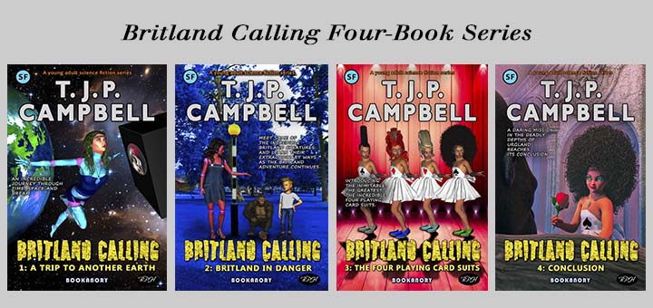
Notice that each book cover has exactly the same positioning of components for all four books (except for the tagline teasers, which are positions according to the background image). All that is fundamentally changing is the background image and the series book number subtitle.
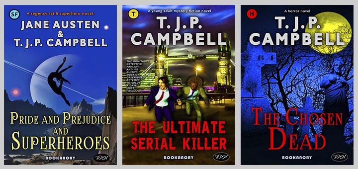
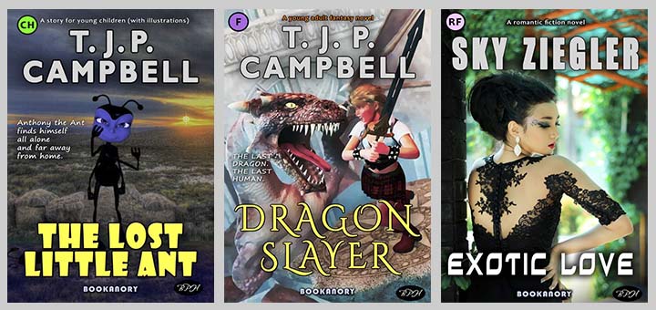
Of course, a fiction series will all be in the same genre (science fiction in the above Britland Calling series, represented by “SF” in a light-blue circular icon located in the top left-hand corner of the cover). But if we have a publishing company, then the genres are likely to follow a colour scheme. So we must compromise the genre colours with our book cover colour schemes. Bookanory Publishing House tends to keeps all its branding (names and logos) in the same position. Below are examples of six different colour schemes for the fiction genres Sci-Fi, Thriller, Horror, Children, Fantasy and Romance respectively, from Bookanory Publishing House (notice the branding is positioned consistently):
So far, so as to aid understanding, and because Bookanory aims to keep consistency with its fiction books, all the books have the author name at the top of the cover and the book title at the bottom of the cover. The most common scheme is to have the author name at the bottom and the book title at the top of the cover. Another popular, but not so common, component scheme is to have the book title and author name in the centre of the cover, and have two bisected background images. Below I show these three popular schemes:
Of these three schemes, I would recommend only the first two, but if there is a strong case for having two images, then the cover on the right might just be the ticket. Examples might be a novel that occurs beneath the sea and on the land. It is always worth keeping schemes as simple as possible. The art is to choose the correct strong images that suit the novel and entice the book browser to seek a blurb (which might then entice them to open the book for a browse, which might then lead them to purchasing the book.
But what about considering different designs for the same book? Below are three alternative designs for a non-fiction book (The Age of Economics):
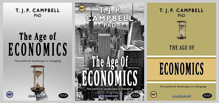
As this is a non-fiction book, notice the use of analogous colours. The idea is to present a serious, sedate cover to match the genre. Also, I have added the “PhD” academic title (yes, I do actually have a PhD, but the title is rarely used unless it is for academic reference). I feel this might encourage the browser to seek further information. However, I think it would be a huge mistake to put a title on a fiction book cover, and even most non-fiction book covers. There are a few examples in the sci-fi genre where Doc or Doctor have been used. But I think it is best not to use such a title in almost all circumstances. But go ahead if you like. If your fiction is great, it would probably work in your favour.
You might notice the scheme of the cover on the right is similar to that of The Frozen Planet cover I designed in Part 1 of this set of articles. So below I show this scheme as a template along with a further two books:
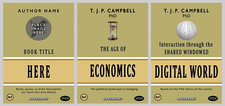
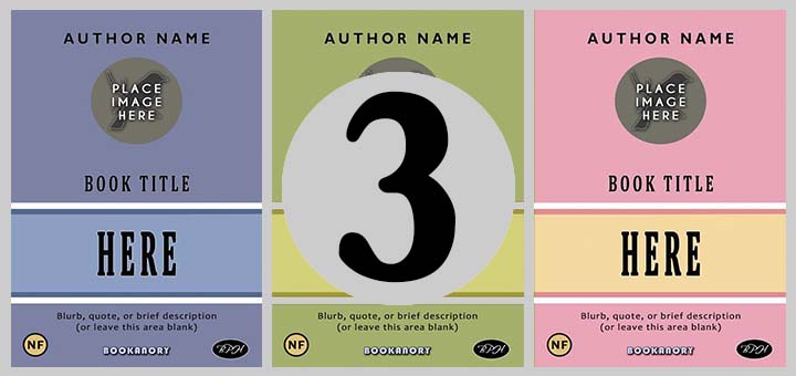
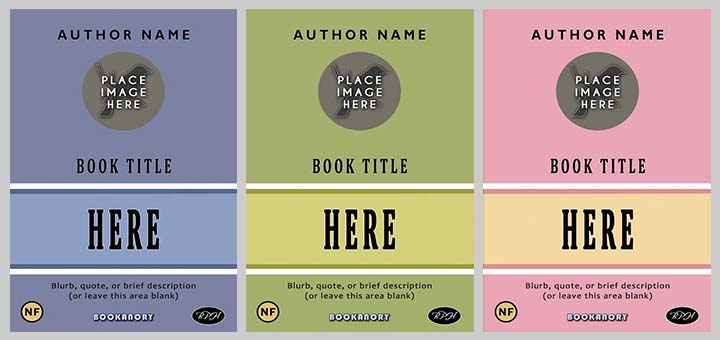
And next I show how we can develop further similar schemes for sets of non-fiction series’. The colours must always be analogous so that a serious, sedate professional feeling is presented, appealing to cerebral mind. Below are three such schemes using teal, pea-green and pink:
I think non-fiction books are the easiest for self-publishing authors to design by themselves, even if they have limited artistic abilities. Just remember to keep a simple scheme and only use one relevant image. You should be able to use Microsoft Word if you don’t have a dedicated image manipulator such as Photoshop. Google to find YouTube videos showing you how to use Microsoft Word to create book covers. There’s about three videos I found back in the day.
And so thus ends this article. Part 3 follows next when I’ll examine well-known archetypes (almost clichés) that are found ubiquitously on book covers. This can be for many reasons.