BOOK COVER DESIGN: PART 5. POOR CHOICES IN BOOK COVER DESIGN


Welcome to Part 5 of my book cover design series. In this final article of the series I will be tackling the topic of poor choices in book cover design; some might be as cruel as to say “mistakes” in book cover design. Come on then, let’s get started.
We humans evolved to find certain groups of colours, patterns and images pleasing. We also learned through our culture, the bias we put on this understanding. There is an element of subjectivity involved, but it is perhaps surprising how closely we all agree on what’s bad and good artistic presentation. And like anything, it requires skill to produce a pleasing and effective book cover. And skill takes years of practice. Also Art is not just a craft, it requires vision; that is to say, talent. So it is not surprising that a self-publishing author will fail to produce a good cover. I will now cover the poorly designed choices often made through lack of skill , talent and learning.
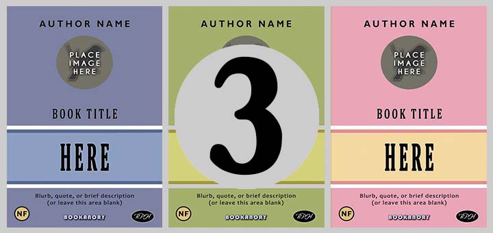
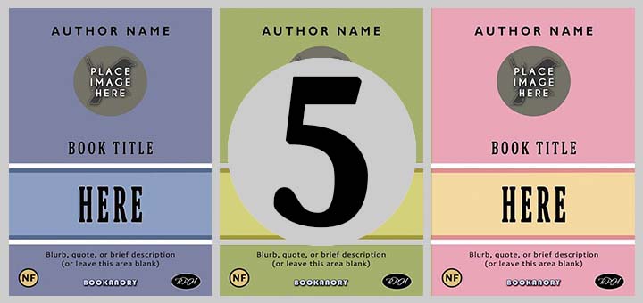
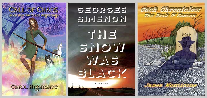
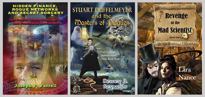
One poor design choice is to make Author and or Title text too small or too difficult to read due to poor font and or colour choice. In both cases the cover will not translate well to thumbnail size. Bad news as many people shop for books online these days. Here are three examples of ‘hidden’ text: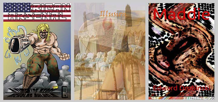
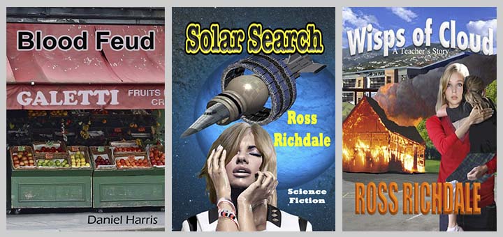
Another design ‘mistake’ is to use a poor font choice. Often Author and or Title text fonts are inappropriate. Perhaps too elaborate. Perhaps too boring (Comic Sans is always seen as a bad choice). A classic poor choice is to make the Author and Title text using same font. Use one font for the Title (the most elaborate) and another for the Author (bold but more subtle). Often a good choice is to use a non-serif font for the Author and a curly or serif font for the Title; or vice versa. Some sort of elaborate to clean contrast is always a good idea. Don’t use more than two contrasting fonts on your cover. So if you use three fonts (say, for a Title, Author Name and a tagline) make sure two contrast and the third is similar to one of the others. Anyway, here are some bad font choice examples leading to poor book cover designs:

Notice that on the book on the left, the same overbearing font is used on both the Title and the Author text. There is no room left for the book cover’s image. Which is disappointing because a picture paints a thousand words (often). The book cover in the middle also uses the same font for the Title and Author text, but this time in an underwhelming manner. Note that the image has been cropped to make way for the text. In the book cover on the left we are confronted with the one font a book cover designer is warned not to use: Comic Sans! And yes it’s a disaster. It truly is the Final Curtain of all book covers Comic Sans. To see how it’s done properly look at the online examples found HERE.
Our next poor design choice in book cover design is to use Low Resolution (or Pixelated) images. I would advise that to be on the safe side you need a resolution of 300 dpi. You can use plugins in photoshop to smooth lower resolution to a higher resolution. This can help. No need for examples here as we all know a pixelated or low resolution image when we see one.
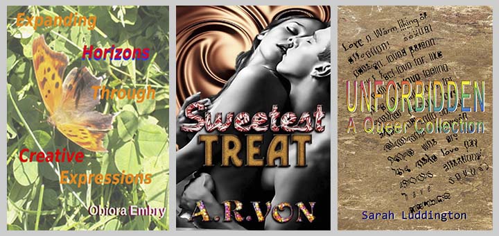
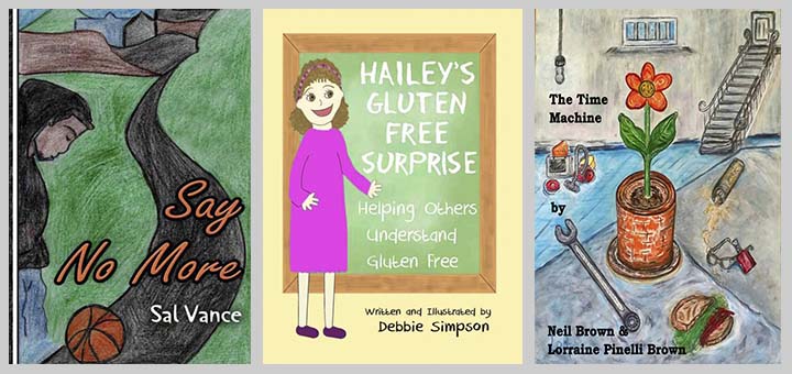
Next we have the poor choice of using rainbow/multi-coloured gradients or colouring of each letter of a word. A gradient on a single colour often works well though. Similarly avoid garish or gaudy color combinations and gradients. Below are examples showing an overload of colours:
There is one exception I can think of to this use of all the colours of a rainbow on text, and that’s when your book might contain the word “rainbow”. Remember, an excellent designer can always break with conventional rules once he or she fully understands such rules. To know the rules is to break the rules. For book cover design though, I would advise a designer not to try to be too clever. The book cover is not the main deal—it simply aims to point the book browser to the main deal: the story!
Always steer clear of Clip Art or Stock Images that come with your computer. Happily this sort of poor choice is rarely made these days. However, I did find this:

To avoid a poor design choice, Drop Shadow on text must be done tactfully. Some say avoid drop shadows all together, but this use tends to be a fashion that comes and goes. In the 1980s a lot of TV series used a heavy drop shadow for episode titles (consider Planet of the Apes). In fact, as I write this article, in the background I have been binge-watching the sci-fi TV series FRINGE to keep me company; and guess what? It uses a heavy drop shadow for the episode titles. Furthermore, in this series, the episodes unusually, even use heavy three-dimensional drop shadows during the action. Huge lettering is overlaid to name locations (I’ve never seen this technique used in any other TV show). I also think this was a mistake as it takes away from the suspension of reality (the verisimilitude). Anyway, below are three examples of poor use of drop shadows that make the book covers look extremely amateurish:
Another common poor choice is to employ inappropriate use of Stroke and Bevel on text is often a poor design choice. The stroke is drawn on the outside of text characters. (and images in general). If it is noticeable then it will lead to a poor appearance of the text and detract from the cover. The bevel is found inside the boundaries of the text characters. If we only use a bevel on one set of text, it will look out of place. This is because it attempts to shows three-dimensional effect. Examples of stroke and bevel overuse are given below (ignore the fact that all these covers suffer from other major design faults):
It’s often a big mistake to use your own artwork, or your children’s artwork, on the cover if you or your children are not professional designers. This is sometimes known as the Refrigerator Art flaw. Many people believe they are better than they actually are. That’s why this poor design choice often occurs. Here are some examples of poor book covers resembling a preteen’s proud refrigerator efforts:
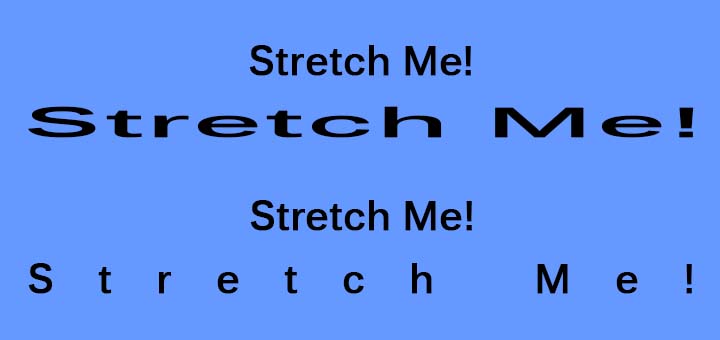
Consider the poor stretching or manipulation of texts. If you are going to stretch fonts, be sure they look good and you have a good reason for doing so. Please notice that there is a difference between stretching a text horizontally and increasing the gaps between letters. usually you should be increasing these gaps and not stretching the letters (which will deform the font). I think it is often all right to stretch vertically, especially if the font is non-serif. but be careful. Below is a diagram showing the different between stretching text horizontally and increasing the gap between characters. Notice the deformation in horizontal stretching.
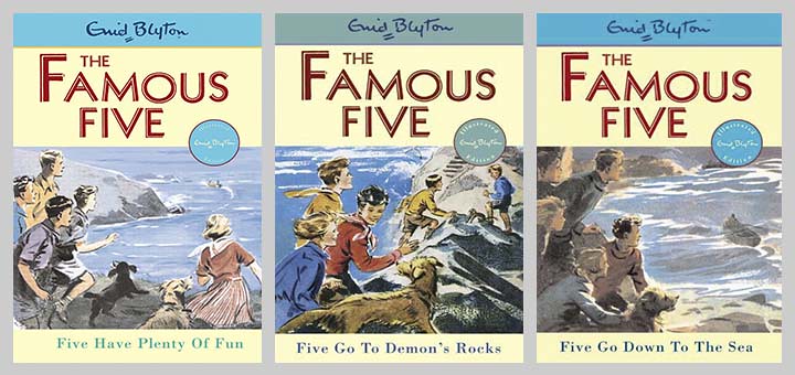
Perhaps the commonest of examples of poor design come from covers that are too busy or overly complex. This often occurs when the author wants all their story characters and a scene from their story on the cover. This is a common fault reminiscent of students handing in complete bible-sized courseworks when few pages would have sufficed (and got them more marks!). The human brain can’t handle too many individual images easily. Don’t forget that most famous of famous papers: “The Magical Number Seven, Plus or Minus Two: Some Limits on Our Capacity for Processing Information”, which is one of the most highly cited papers in psychology. It was published over 60 years ago in 1956 by the cognitive psychologist George A. Miller of Princeton University’s Department of Psychology in Psychological Review. It was true then, and unless humans evolve significantly, it will be true now and in the far future. Just stick to two or three main image components. Enough academic referencing, here are some examples of too much going on:
If you do want to attempt this, I think Enid Blyton’s Famous Five series produces some good efforts (the overall template helps this to work). I believe this works because our brain sees the Famous Five characters as a single entity:
Poor choices of Cut and Paste or Compositing will lead to poorly designed book covers. You need to consider edges, shadows, lighting, colour matching, expert cropping (the hair can be difficult, for instance), resolution of each image. Below are some examples of poor book cover cut and pastes (compositing):
Next, believe it or not, some do-it-yourself authors make the poor design decision of simply placing a photograph on their cover and adding their author name and book title (and possibly taglines). Professional designers know how to do this well, but a non-professional will invariably produce a very poor book cover. Below are three such efforts:
If you want to use a photograph you need to develop the book cover design skills to manipulate it to make a professional looking book cover. Here is how I used a public domain image of Apollo 11 to create a book cover: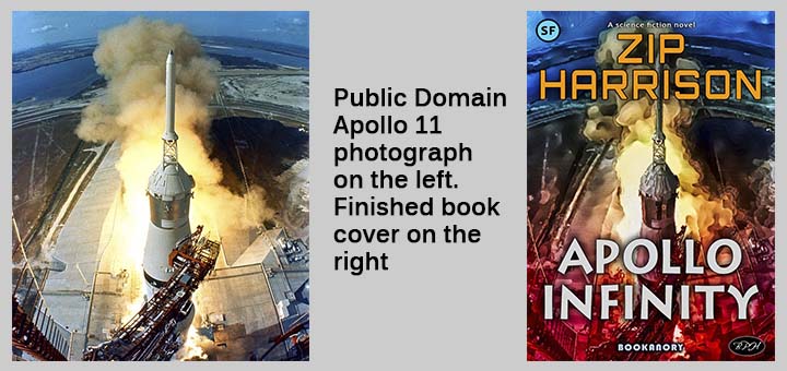
Not designing for the right audience is a poor design choice. One particular poor choice is to misrepresent your genre. If you have written a Sci-Fi novel, don’t make it look like a Romance novel. You need to know the colours, images and fonts that create the looks and moods for your genre. At least know the archetypes of cover design for your genre. The best way of avoiding this error is to take a good look a similar books covers to the one you are designing.
It is a poor design choice to show spoilers in text or imagery on book covers. The most common mistake is to show a spoiler in the main image. Many designer’s make the mistake of showing the powerful finishing scene. Nothing could be worse. It is better to show a teaser that gives nothing away. In Harry Potter books we usually get an interesting scene that pulls us in (the platform 9 and 3/4 in Book 1 or the flying car in Book 2).
Often a poor choice is to make a cover too puzzling. My advice is, don’t try the potential buyer’s patience. They don’t want to waste their time solving a difficult puzzle. Keep your teasers to a simplistic level that encourages the potential buyer to delve deeper. Don’t try to come off as a clever Dick, a show off. No one likes a clever Dick. Try to use your cleverness invisibly. There’s nothing wrong with being clever; there’s a lot wrong with attempting to say, “Look how clever I am?” This is a subtle example of the mantra Show Don’t Tell. Always remember, a potential buyer spends at most a few second browsing book covers, or book descriptions. You must capture them in seconds if not fractions of a second.
Avoid the mistake of designing by committee. Sometimes too many people will have a say on how the book cover will look. Often the author will attempt to manipulate the process as they are paying. A good book designer will take on board all suggestions of the author but make it clear to them that they must trust the professionalism of the designer. There’s an old saying: Too many cook’s spoil the broth. If an author gets too pushy, show them this article. Hopefully, the sight of so many appalling book covers will encourage them to leave you, the designer, alone to complete a professional cover. I mean, no one is perfect, certainly not me, but a designer must work hard and have confidence in themselves and crack on with their designs.
It’s often a mistake trying to be too interesting and original. Many designers get carried away with the book cover and start to see it as an entity in its own right. They attempt a cover that is too original, too interesting. But a book cover cannot be viewed in isolation. It is simply the cover of a book! It is the image that advertises the book. The book is the true piece of art. Concentrate on the main function of the cover–to simply convince the potential buyer to further consider the book.
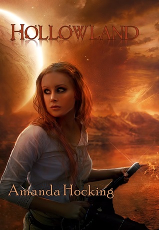
It is a poor choice to fail to get your details right. If the book you are designing a book cover for a book that features a detective who uses a certain type of gun often mentioned in the book (think Dirty Harry’s .44 magnum) then make sure your book cover image show that exact type of gun. If possible, avoid inaccurate representations by choosing images that avoid detailed objects; though if you are using a human with a weapon archetype design as your book cover, you’ll need to know the exact weapon used in the book. I think features of the protagonists and antagonists do not need the same accuracy. This is probably because readers form their own image of the characters in their minds as they read. just make sure your character descriptions (which are avoidable in any case) are consistent within the text. If a character has blue eyes–keep them blue. If possible make sure the cover character also has blue eyes. However, I don’t think such a physical character detail matters as much as a weapon. That’s what the facts bear out. Don’t believe it happens without any detriment? Consider Amanda Hocking’s Hollowland shown below. The cover bears no resemblance to the story (which is a Zombie Apocalypse on current day planet Earth). And the main character image does not resemble the main protagonist character, Remy in any way. But this book was one of the most successful self-published books of all time. Everything seems wrong about it. There were numerous grammatical and punctuation errors too. The plot was too linear and simple and predictable. But I read it, and I enjoyed it. Even the fonts are poor. But the cover gets a mood across that encouraged me to read the book. The first chapter was an easy flowing read. And I found it easy to keep reading. It wasn’t a great story, but it was enjoyable, and I still remember it. So book cover success is not as straightforward as one might think to assess. I think Amanda Hocking is a good writer and a great person. I wish her all the best and I recommend you read one of her books.
To avoid book cover design poor choices you will need to concentrate more with the heart for fiction and more with the intellectual mind for non-fiction. In fact it’s a common aspect of poor design is to fail to appeal to the heart in a fiction book cover. You need to excite or emote with the potential buyer. They are seeking entertainment, a release from reality into fantasy. Promise them what they seek. On the other hand, with non-fiction, keep matters matter of fact and sedate. There is likely to be less symbolism in a non-fiction cover. Promise them through the cover a comprehensive exposition of the subject with an approach that they are unlikely to find in any other book on the subject. You need to put across an impression of trust and expertise. Your blurb will be very important in a non-fiction book.
Finally, to finish off this article on mistakes, I will simply present an example of what I consider an almost perfect book cover in fiction and non-fiction respectively. Below is my fiction example:
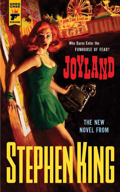
The main image subject is clearly prominent. The Title text is well positioned and readable at full and thumbnail size. The colours are fantastically complementary (the green dress and the red hair and red book Title). Also the bold clean Author text is both analogous to the green and complementary to the red Title. Basically we have an Orange and Teal system working on the top and bottom areas of the cover. the fonts are perfect and contrasting. And a great tagline is on show: “Who Dares Enter the FUNHOUSE OF FEAR?” The mood and design of the cover fits the Hard Case Crime genre. There is no doubt this is a professional job. I think I would have used a white colour for the mini-tagline, “THE NEW NOVEL FROM”, similar to the colour of the main tagline; and also, I would have made the text slightly smaller.
Next I show my non-fiction example:

This non-fiction cover shows great use of analogous colours that suit the non-fiction genre. Good sized Author and Title text. Fantastically simple image of the universe in an actual nutshell. Excellent recommendation tagline in white on the bottom. My only change would have been to make the font of the Title non-serif for contrast (or the Author name for same reason).
There are many mistakes one can make in the design of a cover. I hope I have covered the main one’s for you. In avoiding such mistakes you should be clearer on making better book covers. Good luck!
And so, this article ends my this 5-part series on basic book cover design. There are plenty of online articles that cover the same ground, but I have tried to add my own take and shown many new examples of my own. My final advice is to remind any budding designer is to Keep It Stupid Simple (KISS). Don’t dig a deeper and deeper hole by adding more and more complexity. Less is usually always more in good graphic design. But achieving minimalism is the hardest skill of all. I wouldn’t advise you to attempt that. It’s all about balance.