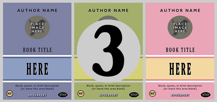
BOOK COVER DESIGN: PART 4. THE MAIN AIM OF A BOOK COVER


Welcome to Part 4 of my book cover design series. In this article I will further examine the fundamental aim of a book cover.
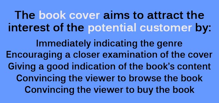
Immediately indicating the genre.
It is important to make the genre clear in an instant. The fonts of the title text, images and some sort of genre icon or genre statement (“A Science Fiction Novel”) all help instantly achieve this.
Encouraging a closer examination of the cover.
The potential buyer will want to know whether the book will be worth looking further into. So not only must the cover be interesting, it must look professionally designed. If the cover looks amateurish, no one will be spending their time and money any time soon. Thus, it is recommended you hire a professional book cover designer who has a lot of experience, or you stick to the advice in articles like mine encouraging you to produce professional looking covers by keeping things simple (always remember KISS–Keep It Stupid Simple). The more complexity you try to employ, the greater your chances of over-egging the pudding.
Giving a good indication of the book’s content.
Now, assuming we have the potential buyer’s interest, we now need to give them a good indication of what the book’s all about. This is achieved through the cover’s images, any loglines (what the book is about in a sentence–possibly on the back cover), taglines (a catchy slogan or catchphrase–more likely to be on the front cover), blurb (on the back cover), the book’s title (it’s meaning and the font used). A buyer usually knows what they are looking for (and if not, your cover must persuade them to buy something on impulse), so your cover has to indicate what literary feast the book is likely to serve.
Convincing the viewer to browse the book.
Now that the potential buyer knows what the book seems to be about, the cover content must be enough to convince them to browse the book further. They might have access to some opening chapters and a table of contents (as is often the case in Amazon). If they are in a book shop, they will have the whole book and will open it up and scan, probably, the opening pages. Whatever you do, please be careful not to give away any spoilers either in text or imagery.
Convincing the viewer to buy the book.
Finally, the aim of the book cover will ultimately be to get a sale. This will depend on what the potential buyer has seen and read so far. Make sure your images, taglines, loglines, blurb, teasers and first five pages are so compelling that a potential buyer becomes a converted excited buyer. Then make sure you deliver on the promise you have made through your cover and first five pages. Then you’ll have a fan and be able to sell more books to them.
I finish with an example. I will just use the following ebook cover from my four book Britland Calling Series:
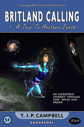
Let us examine how the aims of this cover have been met according to the main points in this article:
- The buyer should instantly recognize this book as being in the Sci-Fi genre. We see a Sci-Fi logo in the top left-hand corner. The top text stating: “This is a young adult science fiction series”. Also the tagline confirms this. The images also instantly imply Sci-Fi.
- The cover looks professionally designed in that the colour scheme is a version of the well-used Orange and Teal. Also the fonts are well placed and perfectly centered. The images are well positioned with the female figure dominating the whole image. The planet and cube craft balance each other either side of the main figure. The publisher’s logos at the bottom add to the professionalism of the product.
- The cover indicates the sort of book on offer. It is a science fiction book for young adults. There is an element of fantasy in it indicated by the tagline (“An incredible journey through Time, Space and Dream”) and through the female figure who appears to be a living dummy.
- The cover has some interesting elements that might convince the potential buyer to browse the book. Why is the land blue and the sea green on the planet Earth? What is the cube craft all about? What does journeying through Dream mean? Where is Britland? What exactly is this other Earth? Why is there a living dummy on the cover and are there other living dummies? maybe she’s a robot or something?
- Finally, the book opens using a frame technique. Something unusual is afoot. Will all this be enough? It might not have to be, because this is a four book series. And this is a great trump card, Why? Because it can be given away free. Also the user knows if they like the book, there will be three more they can read. Having a series, allows a lot of business selling strategy with different prices possible.
That’s the end of this article. I hope you enjoyed it. Next, in Part 5, the final part of the series, I will be examining mistakes to avoid in book cover design.