BOOK COVER TEXTS: PART 1. BASICS

In this series of articles, I will examine texts that we use on book covers. As stated in other articles, the main texts we use on book covers are: the Author Name, the Book Title, Series Title combined with Book Episode Title, any Taglines, any Logos and the back matter Book Blurb.. I will limit the most detailed exposition to the science fiction genre, which is the area I write books and design book covers for myself and other authors.
Texts are usually created with Fonts which are then enhanced with various effects (colour, dirt, strokes, glow, drop shadow, distortion, and so on). We will only consider all the texts that use fonts as their basis.
Once a font (or set of fonts) is chosen for a word, then various amounts of manipulation will be used. We can adapt the size, spacing between characters, position of characters and words, the colour, the general orientation (italic, bold). Then more advanced, we can incorporate stroke (the perimeter of each character), inner glow, outer glow, drop shadow, sheen (satin effect), bevel, pattern overlay. The detail to which we apply such manipulations is limitless. But as always, remember KISS (Keep It Stupid Simple). Don’t over-egg the pudding. The taste will be either too sweet or too sour to digest.
Here is a link t0 25 Hand-picked Free Fonts for Sci-fi Book Covers. There are plenty of public domain free fonts, so I will only be using them. I never use non-free fonts because it could cause problems for buyers. There is just no need to involve yourself in the complication of licensing and so on. Also, beware that some font makers claim that they offer free fonts, but their “free” fonts are sometimes copied from non-free fonts. So be careful. It might help for you to know that the font is no longer a font once it becomes part of an image. A book cover might be based on fonts, but it does not contain any. A word processing or typesetting program does. But the laws of copyright are very complicated, and sometimes only in a court of law can any claims be made. My advice is to do everything you can to ensure your font is truly free. If you want a font that’s different, just create your own using a free font as a basis and then manipulate the font with a font editor application. I’ve done this a few times, but I find it easier and less time-consuming to use direct manipulation on the rasterised image of the font.
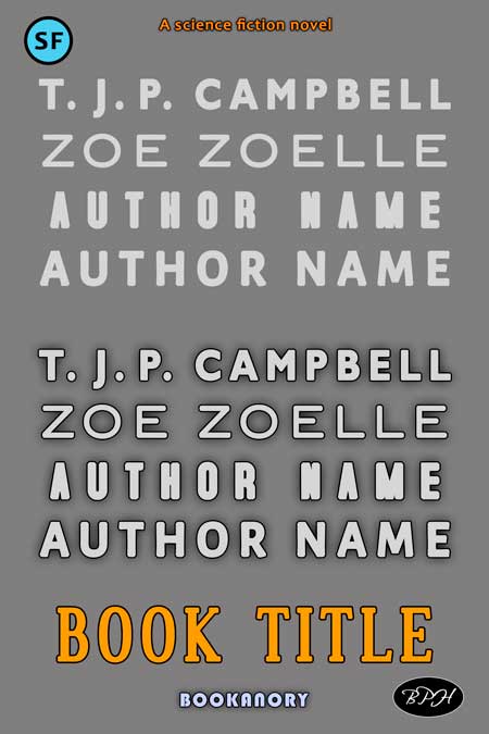
Let’s get started. Below I show a 6 x 9 inch scaled image of a book cover with two sets of a quartet of Author Names I have also added some branding from my company and a Book Title example. The first quartet is simply the raw font. The second quartet shows a black stroke and minimal drop shadow. Whether you use strokes and drop shadows depends on the background. Just don’t over do it. Finally, I have used sans serif fonts for my Author Names and a serif font for my Book Title. This just makes a contrast easier. You can use a serif font for both Author and Title, as well as a sans serif. The only reasonable rule is to make them contrast. And we shall see how to do this with examples later on. The four Author Name fonts used from top to bottom are Gill Sans MT Bold, BlairITC TT Light, Accidental Presidency and Alegreya Sans Medium. The Book Title font is Dustismo Roman (serif). Note that I have added extra spacing between characters to give the Author Names and Book Title a movie lettering appeal. And here is the book cover image:
Next, we look at adding colours and gradients. Here we go: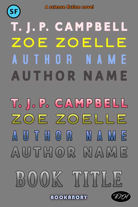
And here is an example of a book cover using the Alegreya Sans Author Name (Rose Tyler) font and the Dustismo Roman Book Title font. I have also used colour gradients on the Author’s names and a pattern overlay of metal on the Book Title: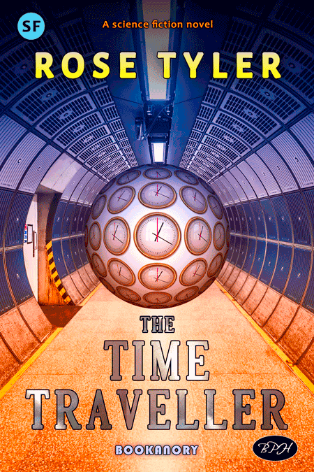
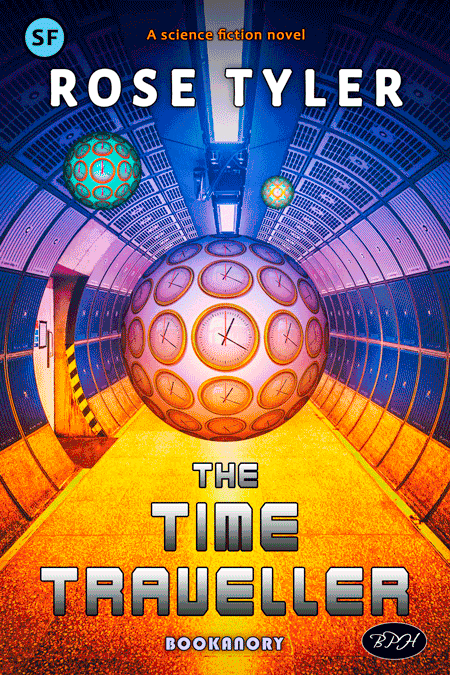
To end this Part 1 article on book cover text basics, I have used the sci-fi Karnivore Bold as my Book Title font and used more subtle use of colour and colour gradients. I’ve also gone for a slightly more sophisticated image (applying blur to achieve distance with two copies of the clock sphere. I’ve also made use of complementary colours in the Orange and Teal mode. Lastly, I used a darkening gradient at the top of the book cover to allow the Author Name text to stand out. The whole effect is to have a bright coloured pop out book cover. And here we are:
In Part 2 we will examine some more advanced examples and techniques of text methods.