BOOK COVER EMULATION STYLE: PART 1. DETECTIVE-THRILLER BOOK COVER

Welcome to Part 1 of my 3-part book cover copy style series. These 3 articles will deal with the emulation of bestselling book cover design styles. In this series I will show how a professional book cover can be achieved by taking examples of professional well-known covers and producing my own cover in a similar style (not plagiarising the covers, which is almost impossible if a different set of images and title and author name is used (incidentally, please note that a book’s title cannot be copyrighted). Hopefully, this series will show any interested book cover designers how to produce truly professional covers. This chapter will examine producing a book cover in the style of a detective/thriller book. Please bear in mind that it would be wise to use different but similar fonts and adjust other components slightly if you are worried of being accused of plagiarism. I doubt you could be accused of plagiarism though, as component parts of book covers are generic. Of course, you cannot copy branding (logos and trademarks). That would be plagiarism. And your images should be original. The whole point is that this approach gives you the opportunity to see if you can design and create highly professional book covers as you can more directly compare them with book covers you know are top-drawer. Okay, let’s get started.
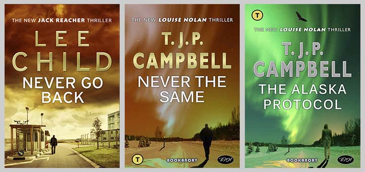
I will start by considering Lee Child style book covers. Below I show a trio of his Jack Reacher covers:
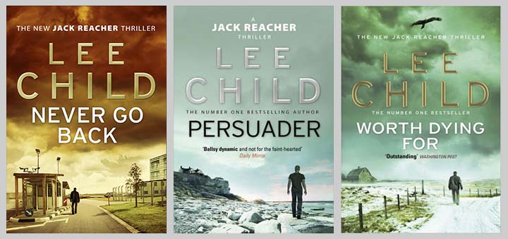
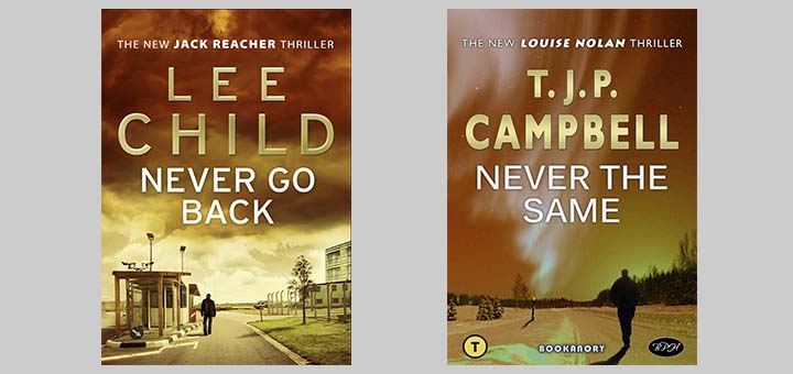
In each we see a man close to being a silhouetted figure walking in a relaxed fashion into the distance. This is typical of Lee Child’s Jack Reacher novels. Keeping an open mind, I will start with Never Go Back, the book cover on the left. Initially, I will use just two public domain images: a landscape image of an Alaskan Road in winter with a display of the Northern Lights in the sky, and a man walking away. The first attempt will be to make the book cover almost the same style, look and colouring of the original. So I went ahead and created the book cover for a book titled Never The Same. My Thriller novels usually feature an ex-policewoman detective called Louise Nolan. Here is a side by side comparison so you can see the similar professional (hopefully) style:
I feel I achieved my aim of creating a Lee Child genre professional book cover. The style is similar but subtly different. But I have not quite finished the task yet. The final stage will be to finish off the book cover so that it is totally original and relevant to a strong title. For instance, I have shown a man walking into the distance, but my protagonist is obviously a female; namely, Louise Nolan. But first, I will discuss this intermediate stage.
For Never The Same, I chose similar fonts (but they are in fact different if you closely examine them). I also italicized my protagonist Louise Nolan mentioned in my tagline at the top of the book cover. One noticeable variation is my Author Name font. I decided to keep my regular branding Author Name font (Gills Sans Bold). This forces the finished product to be more original, so it is a good move, I think. Lee Child’s font is well spaced horizontally (possible because he has a short first and last name) and non-bold. He also has a slight bevel (the printed books probably have a raised bevel too). I decided I would place a slight bevel on my Author Name in keeping with the Lee Child style (something I don’t normally do). I also made my Author Name smaller than it usually is, which allowed me to add a slightly wider character spacing. This, I feel, was a reasonable compromise. And it is also worth noting that Lee Child book cover texts have minimal drop shadow and outer stroking, which I also approve of in this particular overall design. Below is a comparison so you can see book covers that perhaps overuse drop shadow (the book in the middle) and outside-edge stroking (the book on the right):
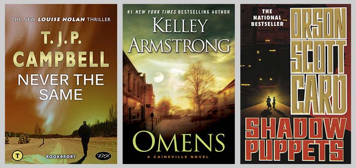
I don’t think drop shadows are necessarily bad (as some designers do), but I think they should be avoided under certain conditions. If you look at Kelly Armstrong’s cover above, the designer of the cover should have realised that it does not quite balance to have no drop shadow in the book title OMENS (it cannot have a drop shadow as the background is black and any other colour would look ridiculous), yet have an intermediate drop shadow on the Author Name. The solution would have been to simply move the dark section of the sky down a small amount so that the Author Name was overlaying a dark background like the title OMENS at the bottom of the page. Then the drop shadow could have been lessened significantly. In fact, the book cover image would be improved as it would follow the Rule of Thirds. I would also add just a touch of darkening gradient on the sky (this would better reflect the bottom of the book too). Of course, a lot of design is subjective. I still think the cover is excellent on Armstrong’s book. It’s close to Dean Koontz’s Odd Thomas covers (especially if the drop shadow gets removed!).
Back to my intermediate Never The Same book cover. Unfortunately, because of the tagline’s position, I was forced to move my genre logo (the black “T” in a beige circle) to the bottom left-hand side of the cover. But in the next stage I should be able to remedy this break in Bookanory Publishing House general branding style. Advanced design skills involved the skill to know how to choose and position the crop of my Alaskan landscape image. I have used a subtle use of the Rule of Thirds (basically this is where an image is partitioned into six equal areas by drawing four equally spaced horizontal line and four orthogonal (that is to say, vertical) lines. Using the lines or the partitions, you decide where your images go. I feel I have positioned the pole on the left-hand side of the gently arcing road in a diagonal with the walking man in an aesthetically pleasing way. I know if I move down the tagline, place my genre icon back in its usual top left-hand corner position, and add an image right in the centre at the top of the cover, above the tagline; then I will have a perfectly balanced cover. Finally, on this Never The Same intermediate stage book cover, I added a subtle degree of colour matching on the walking man which has been cropped out of the public domain image. Advanced skills involved feathering the edges and adding realistic shadows. I also added a shadow to the road pole to help make the shadow of the man make better sense (I also added hints of shadows on the small trees to the left of the pole). You would need to do some photoshop tutorials on colour matching, refining edges and creating shadows (using gradient blurs) to conquer adding these last touches. I think the skill of picking the right images and placing them well, requires a lot of experience. You would need some sort of natural ability too. I did use some clone stamping, paint brush and warping. Also I had to use some standard filters to get the correct colours required (I used hue, curves, color balance). I would advise you at least go through PHLEARN’s youtube videos.
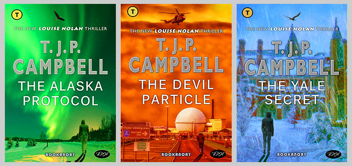
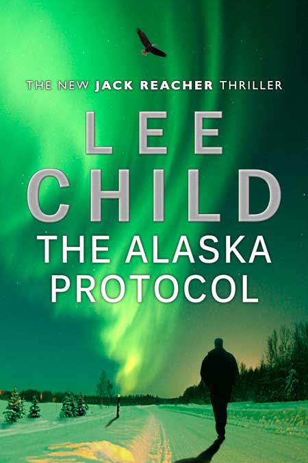
Now I will replace the man with a woman and add at the top of the book cover an Alaskan Bald Eagle (a powerful Alaskan icon which makes it a great addition to the book cover). It makes sense to add an image at the top of the cover, design considerations aside, especially as I notice by examining all of Lee Child’s Jack Reacher book covers that most have a small image at the top of the page, such as an the moon, sun, airplane, a helicopter or even a bird. I shall try to make the book cover all make sense in terms of the Alaskan landscape and Bald Eagle, and the book title. Having looked at the Lee Child book cover of Worth Dying For (see the book cover on the right of the Lee Child book cover trio given at the beginning of the article), I realise with this new design opportunity, I can move my Bookanory Publishing House branding genre icon, back to its usual position at the top left-hand corner of the book cover (as I mentioned earlier). I intend to emphasize the green-curtained Northern Lights, so my colour scheme will be changed to an evocative fading green late winter Alaskan evening. The title I will choose (for a book I will write as the second book in my Louise Nolan trio, the first book of which is The Devil Particle) is The Alaskan Protocol. Below is my finished product:
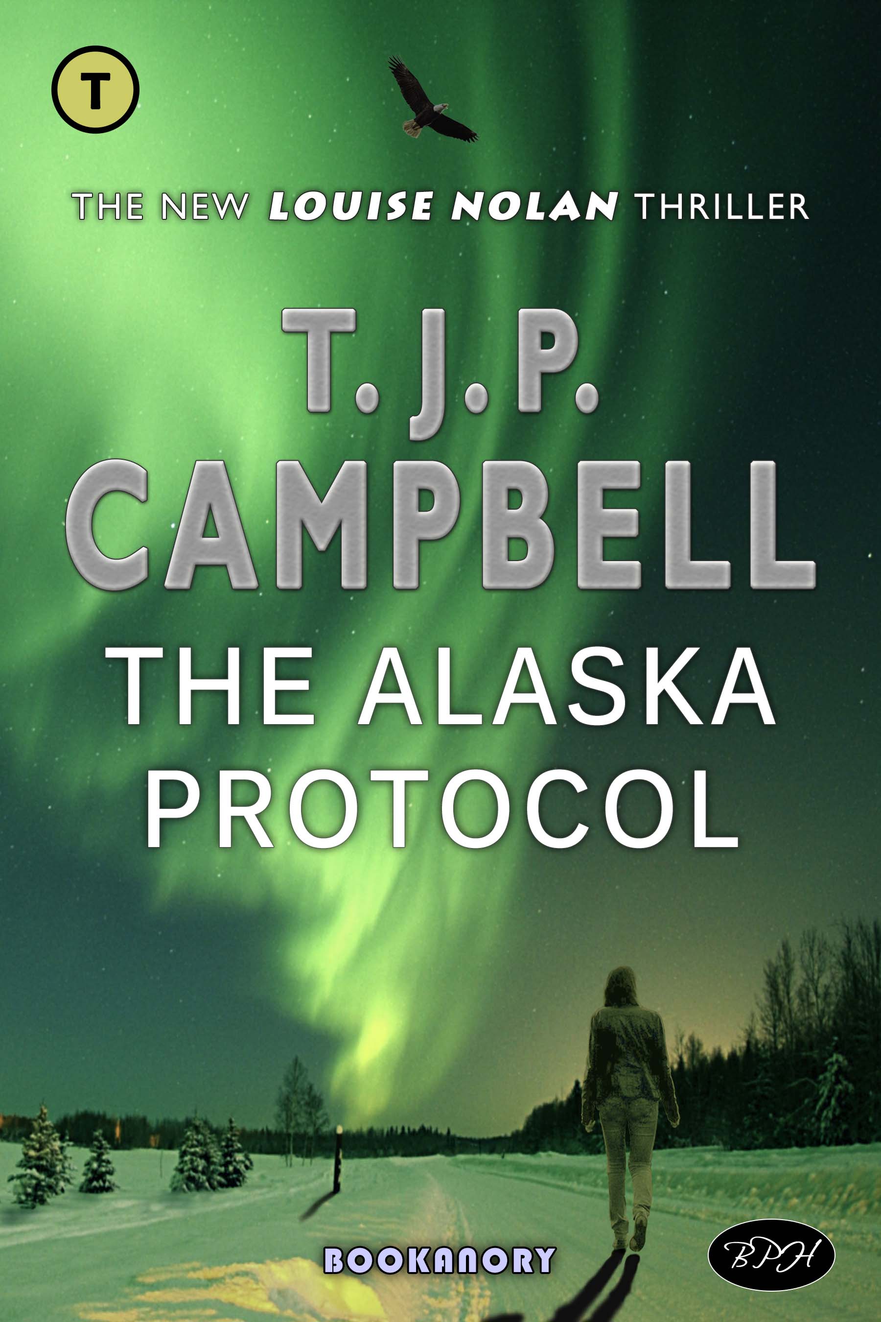
First off, I changed my Author font to silver instead of gold. This works better with the new colour scheme. I have added slightly more bevel and a very subtle grain overlay on the Author Name letters. I worked hard on getting my image of Louise Nolan as artistically pleasing as possible. Bearing in mind the original image was grey-scale, it took a few hours of work. I had to colour match and add some colours with the paint brush to turn it into a slightly coloured image. I am happy with my efforts. The woman looks to me like she belongs in the scene, and I managed to add a nice subtle winter glow on the edges of her outline (using paint brush, outer and inner glow). As a perfectionist, I could go back and improve the woman’s shadow as it might be a touch too dark, but I’ll leave it alone. After an extra day’s work of micro improvements, I would charge $1,500 for this cover if a bestselling author’s publishing house requested it (on the assumption the title was The Alaskan Protocol and the protagonist was a bad-ass woman, like Louise Nolan). The reason for the price is a combination of artistic designer skills and the choice of images. Don’t get me wrong, some book covers I do will only cost $50, but they would never match The Alaskan Protocol for overall emotive imagery. Also they would not take all day to do! Below I show how this cover with the Jack Reacher walking man put back replacing the walking Louise Nolan would look. If I was really doing this cover for Lee Child’s publishers I would improve the walking man to the standard I achieved for the walking woman. Anyway, here’s the cover as a Lee Child Jack Reacher effort (note, I couldn’t find the exact Author Name Lee Child font):
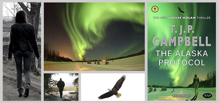
So that’s it for this Detective/Thriller Lee Child genre style book cover article. The next article in this series will look at the same exercise enacted in the Dystopian genre. To finish off, I leave an illustration of the images I used to produce the final book cover (please note that I used a reflection of the original Alaskan Landscape image and the Bald Eagle), and an illustration that shows the progression from the original Lee Child book cover to the final T. J. P. Campbell book cover. I also show an illustration of my trio of Louise Nolan Thriller novel book covers all in the same Lee Child type styling. And last, but not least, I show how you can present a trilogy as a floating cube using this Louise Nolan trilogy.