BOOK COVER EMULATION STYLE: PART 2. DYSTOPIAN BOOK COVER

Welcome to Part 2 of my book cover copy style series. In this article I will tackle the Dystopian genre. First let’s look at a collection of highly professional bestselling dystopian books (I will steer clear of covers with unique symbol-based covers such as The Hunger Series). This is what I have come up with:
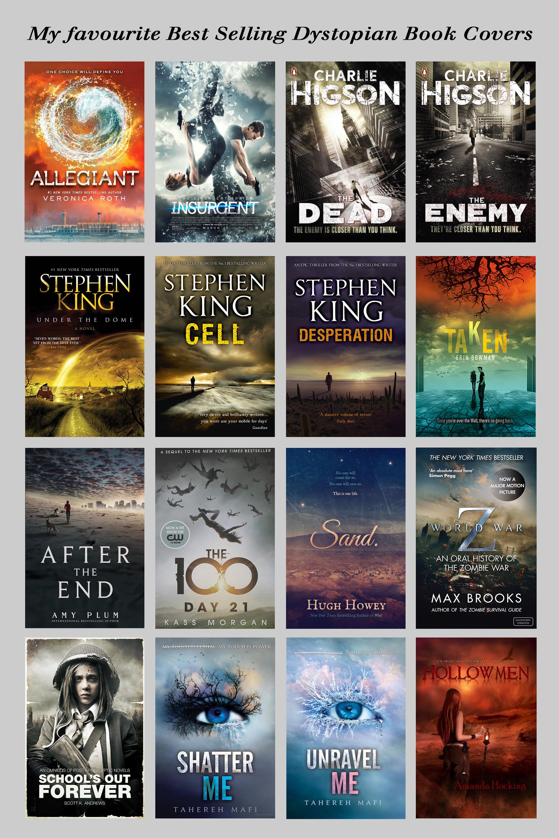
I think the Stephen King covers are quite professional, but I think they are too much like the Lee Child covers that I have already tackled, so I will forget them. I like the way Taken uses the Rule of Thirds so well and backs this up with a perfect Orange and Teal complementary colour scheme. And as a nice touch it moves the letter “K” to empathise the “Taken” theme. I also think School’s Out Forever is a good cover, but I see it only as a starting point. I would add colour here with some blood and scars; also I would manipulate the face to get a strong movie look using my photoshop skills (for instance, I would implement dodge and burn techniques to present a dramatic complexion on the girl’s face). However, I have decided to use a combination of Shatter Me by Tahereh Mafi and Max Brooks’ World War Z. I like the fonts and text positions in the former and the devastated city in the latter.
So I searched online and found two public domain images:
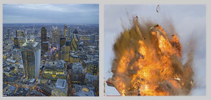
I then manipulated the images with photoshop and added some smoke. And I ended up with a classic Orange and Teal scheme (note that Shatter Me had a very subtle Orange and Teal achieved by the orange “makeup” above the eye, which is why that cover worked so well). And here is my emulated style:

And to see the comparisons with my two model originals and my finished cover:
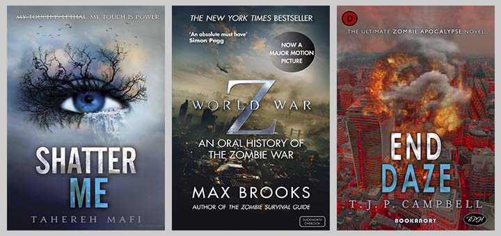
I am happy with this book cover. The city is burning with a deep heat that almost burns the fingers at the touch. The city is a complete and utter tinderbox. I think the title is outstanding and justified me using the tagline “The Ultimate Zombie Apocalypse Novel”. I have written a draft for this novel already. Now I have a cover that can inspire me to finish the novel anytime soon. Note that I did have to use a slightly different font for my title than the original inspirational cover font. I also increased the horizontal spacing of the characters because I had two short words. If that title and cover doesn’t sell thousands of copies of the novel, I don’t know what will. Of course, that’s probably wishful thinking–but it’s always good to be realistically optimistic.
Remember, the object of these book covers based on professional bestselling book covers is not to be a copycat, a plagiarist, but to simply show that emulating such covers is possible and you have a guaranteed professional cover. I think it’s also good practice to allow your thinking to be influenced by others. One thing I’ve already learned by doing these articles is that plain fonts work best and the elaborately stylish fonts I have often used in the past actually look a bit amateurish. I shall be using more plain fonts in the future. The truth is that the more book covers you do, the more you get to appreciate that the aim is to get the book cover to work as a whole. That’s why no matter how incredible a particular highly stylised font may look in isolation, it is likely to ruin the synergy of the overall cover by detracting from the other components (as 3-D fonts would tend to do). I did look at this, for instance:
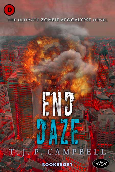
Here it might look like this is a great font for the title. But it is competing with the exploding city behind it. So it is a bad choice overall. We want the observer to look at the cover and see if we can get them interested. I think the words of the title END DAZE are more important than the font used in isolation. I feel the words are clever as they are similar to END DAYS and we are talking about a novel concerned with an “Ultimate Zombie Apocalypse”. Also I would want the reader to be mesmerised by the heat of the smouldering inflamed city centre. And when they look above the flames for relief they will be drawn to the tagline “The Ultimate Zombie Apocalypse Novel”. Along with the title, I would be confidence that within a second they would search for the blurb (or it would be a book they would never read, and they could quickly move on to things that have more interest to them. I hope you can see my point.
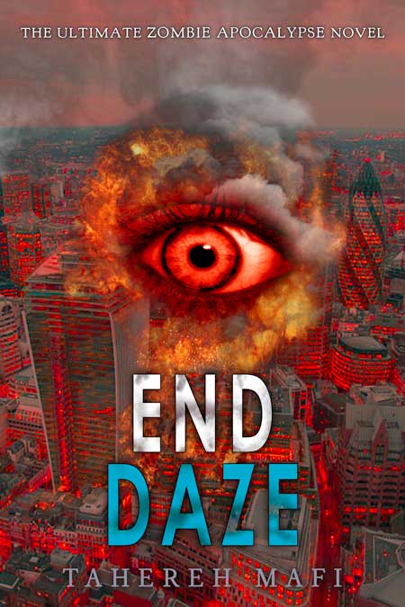
Here is how I would have created this cover for Tahereh Mafi if she had written End Daze instead of me:
Well, that’s it for this chapter. Next I will consider some science fiction emulations. As this is my main writing field, I will be undertaking a handful of examples. The next article in this trio of book cover emulation articles, Part 3, will feature in particular an Isaac Asimov emulated styled book cover.